

IMPORTANTThe views and opinions expressed in this article are entirely personal and do not reflect the official policy or position of any affiliated organizations or institutions.
Lately, I’ve been thinking about how often we feel lost—not just physically, but digitally. The internet, vast and intricate, can sometimes feel like a chaotic city with no street signs. Navigating through websites and apps often becomes a frustrating experience. This led me to wonder: why is it that the places we go to online—places we visit every day—are often harder to navigate than a well-planned city? The answer, I believe, lies in design.
Walking Through the Digital City
In our physical world, urban planners have spent centuries shaping spaces to guide people intuitively—through roads, signage, and public infrastructure. Yet online, where there’s even more information and less physical intuition, this logic often breaks down. Badly structured digital environments can confuse, frustrate, and exhaust us. What strikes me most is that something as seemingly small as a navigation bar has a surprisingly profound effect on our digital experience.
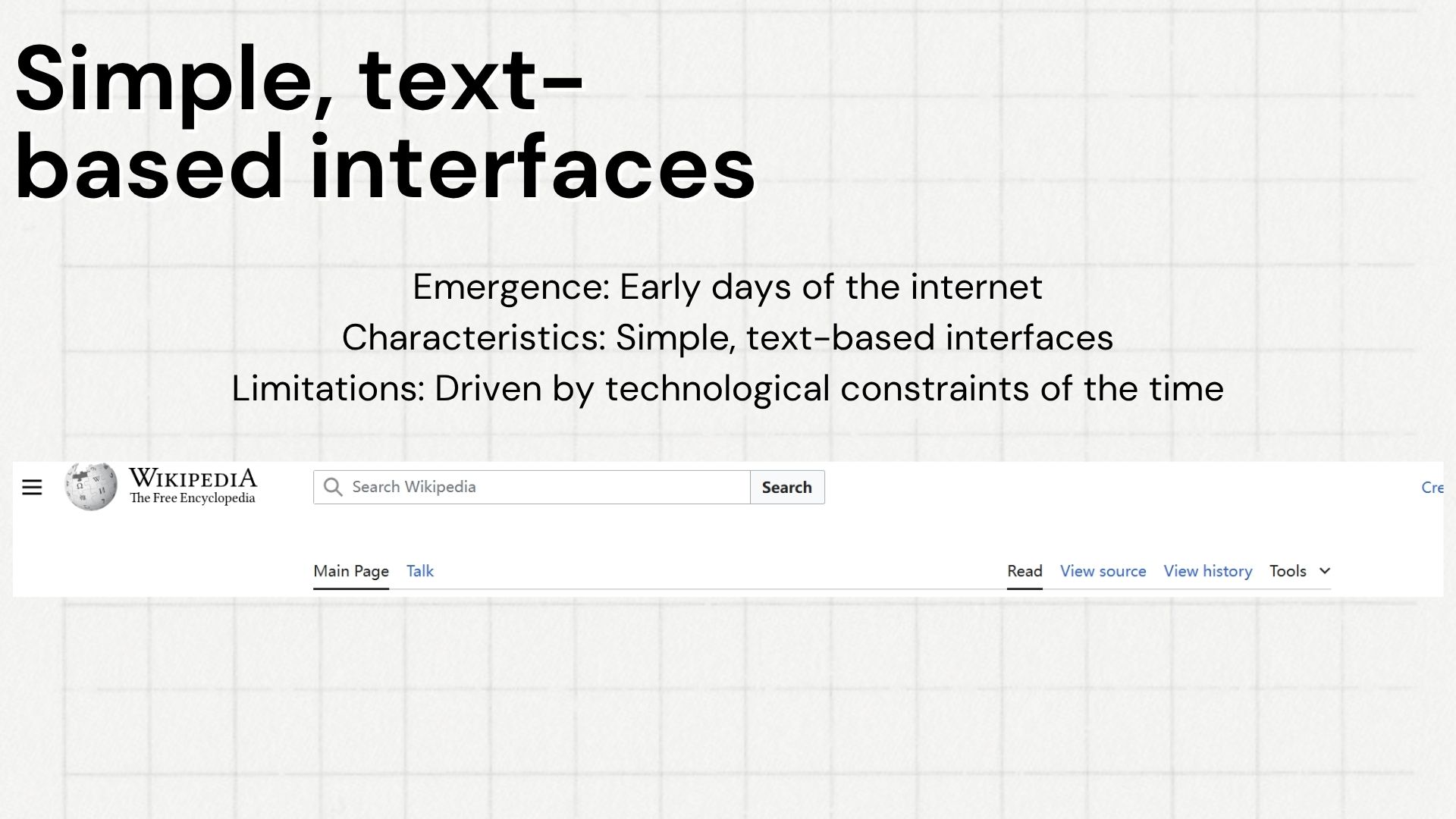
The earliest interfaces were utilitarian—text-only layouts that worked due to the simplicity of early internet content. But as websites evolved, this model quickly became limiting.
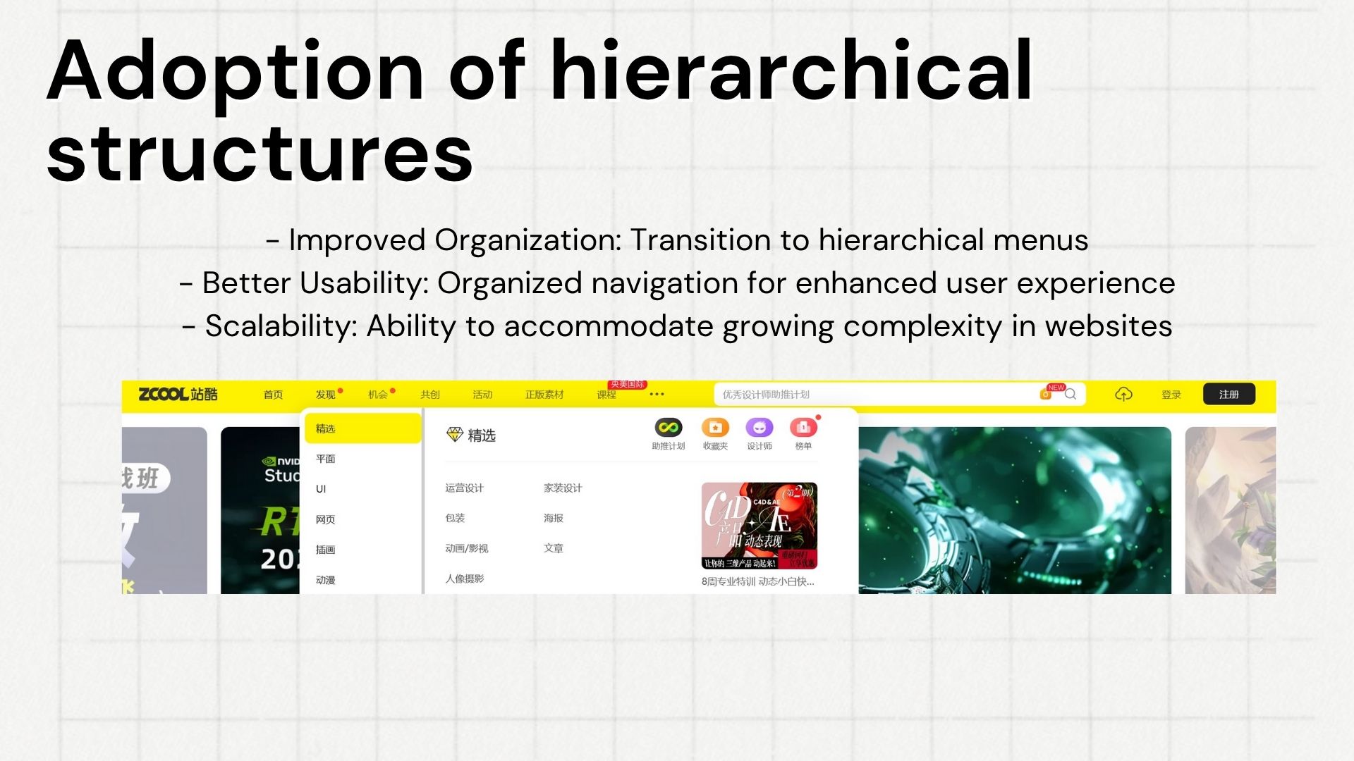
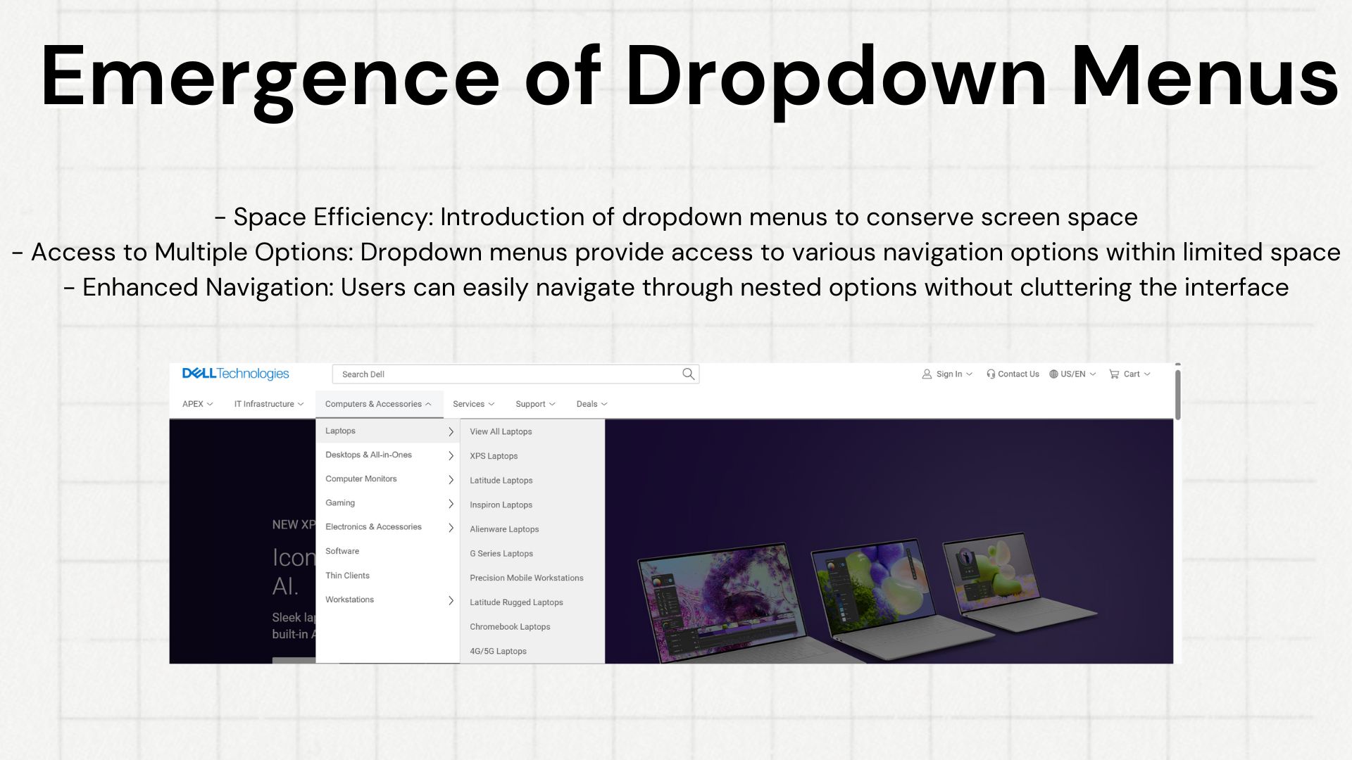
From Clutter to Clarity
As I traced the evolution of navigation bars, it became clear how design has responded to complexity. Early websites were simple—text-based, linear. But as the internet grew, complexity did too. Navigation bars became the interface between us and the information we needed. That’s where graphic design, more than just aesthetics, steps in as a kind of problem-solving language.
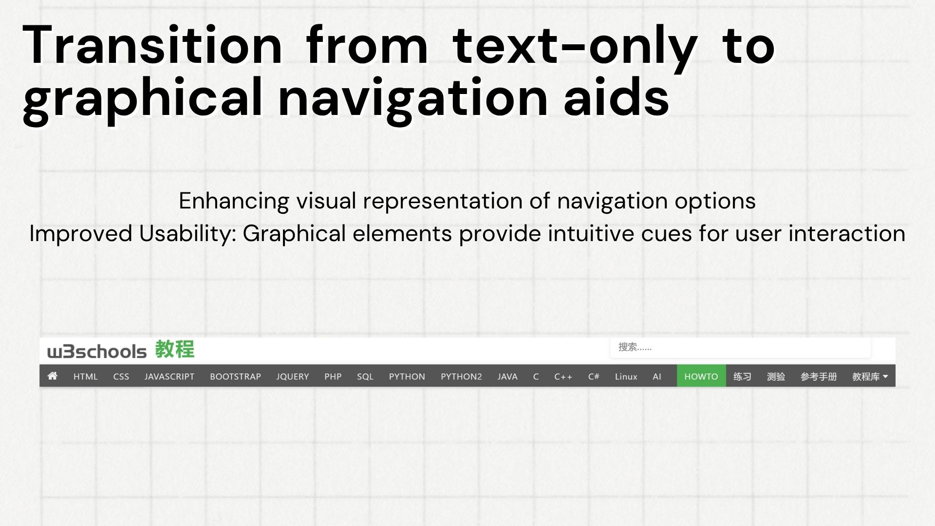
Transitioning from text-only to graphical elements not only improved usability but helped bridge language and interpretation barriers. Users could now rely on universal visual cues rather than dense labels.
The Art of Making It Easy
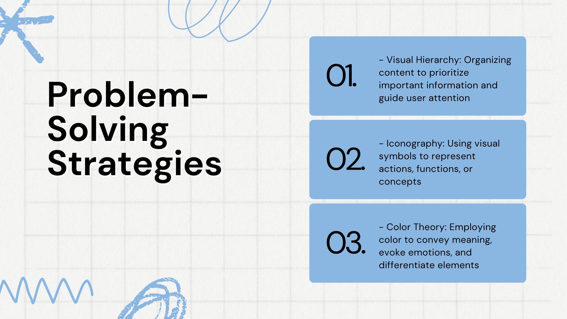
Graphic design in navigation is about reducing cognitive friction. I find it fascinating how theories like cognitive load and visual hierarchy play such a critical role. We only have so much brainpower to spend on figuring out where to click. A well-designed navigation bar respects that. It guides us gently, using scale, placement, and color to say: “Start here,” or “This matters more.”
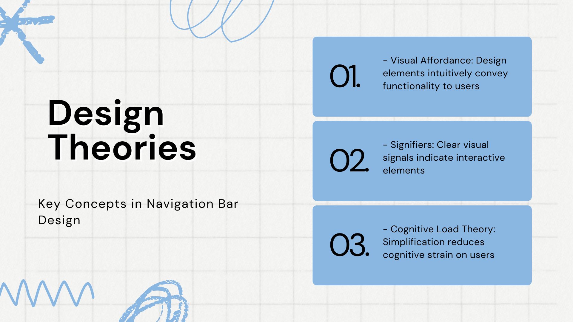
Key concepts such as visual affordance and signifiers help users recognize functionality at a glance. Simplicity is not just aesthetic—it’s a practical tool to preserve mental energy.
Design as a Problem-Solving Strategy
Structure Matters
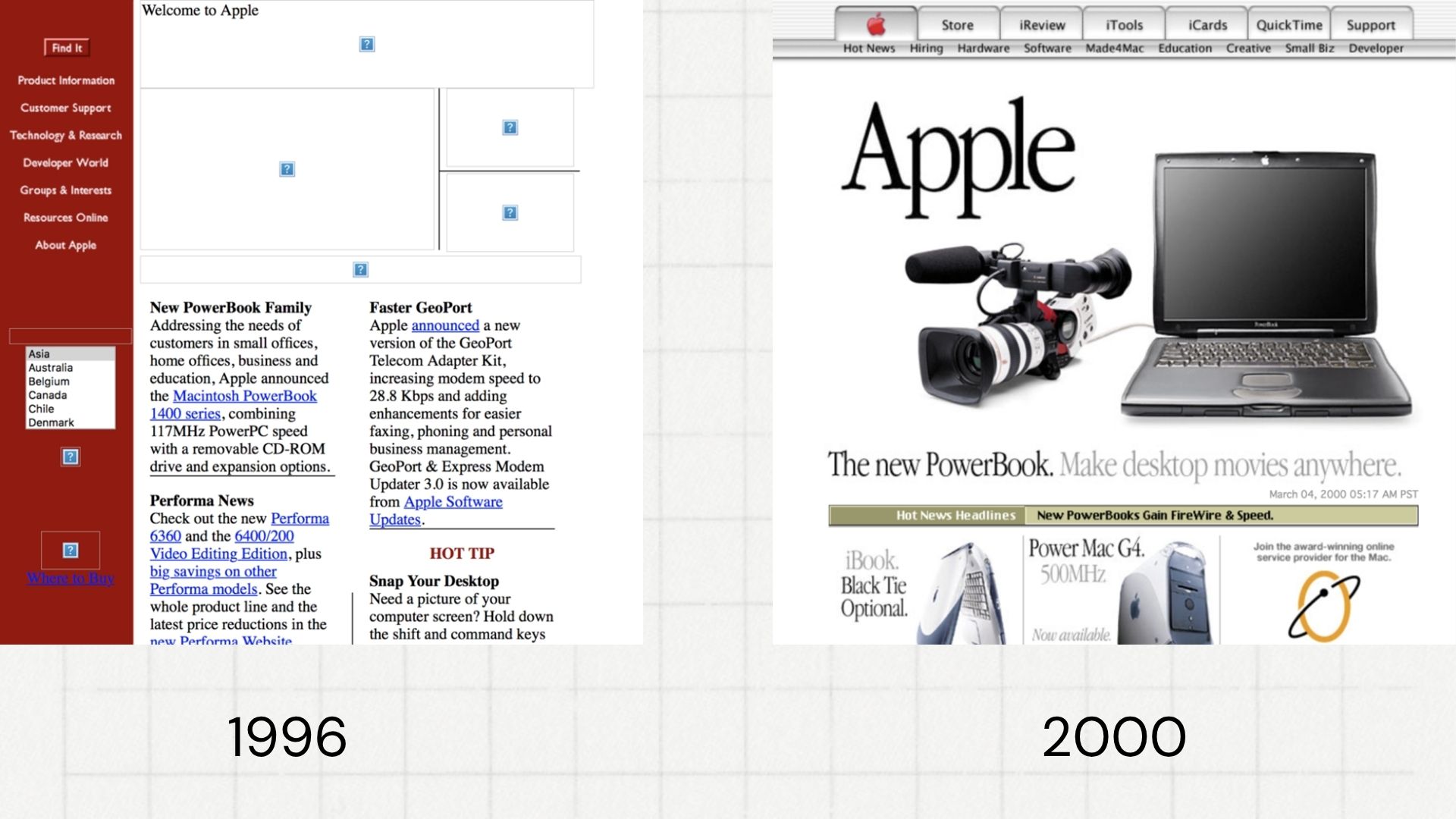
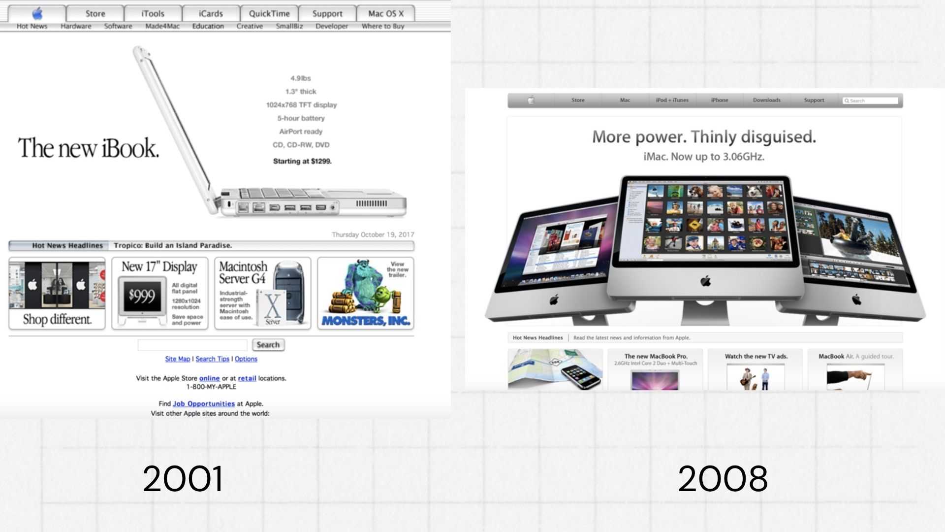
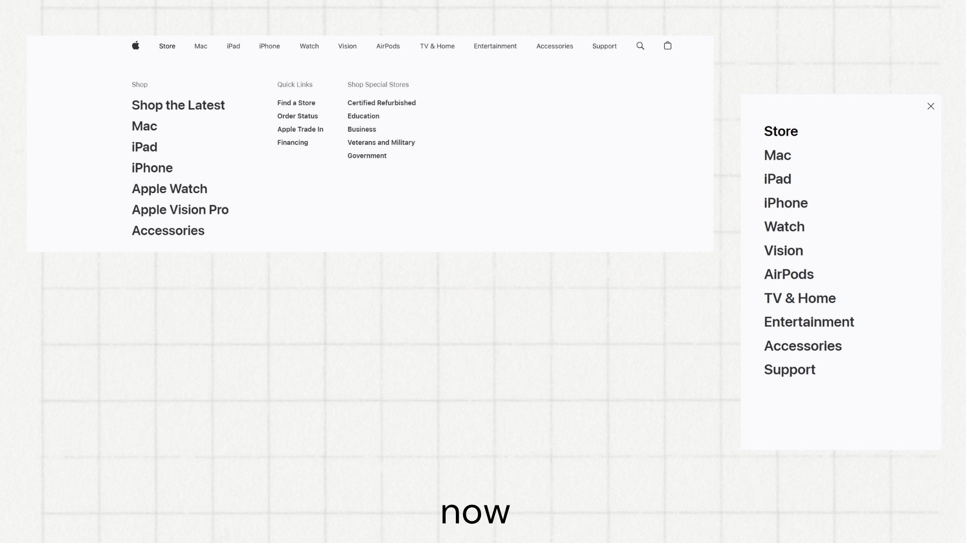
The Case of Apple
Apple’s evolution in navigation design demonstrates these ideas in action.
Graphic Design as a Guide
So next time I click through a well-designed interface, I’ll be reminded: this was built by someone who cared whether I got lost.