

IMPORTANTThe views and opinions expressed in this article are entirely personal and do not reflect the official policy or position of any affiliated organizations or institutions.
Graphic design often gets reduced to visuals—colors, fonts, or stylish posters. But the more I’ve thought about it, the more I’ve realized it’s not just about making things look good. It’s about making things make sense. From subway systems to tech logos, design isn’t decoration—it’s direction, clarity, and sometimes, even cultural commentary.
What Graphic Design Actually Does
At its core, graphic design is a tool for visual communication. It combines symbols, text, images, and color to transmit meaning and influence how we interpret the world. Good graphic design does more than decorate—it distills complex ideas into intuitive visuals. It shapes how we navigate spaces, engage with brands, and absorb information.
Its influence touches many fields: branding, digital interfaces, publishing, advertising, signage, and more. A well-designed graphic is the silent force that directs user experience, whether you’re scrolling through a website, walking through a transit hub, or picking up a product on a shelf.
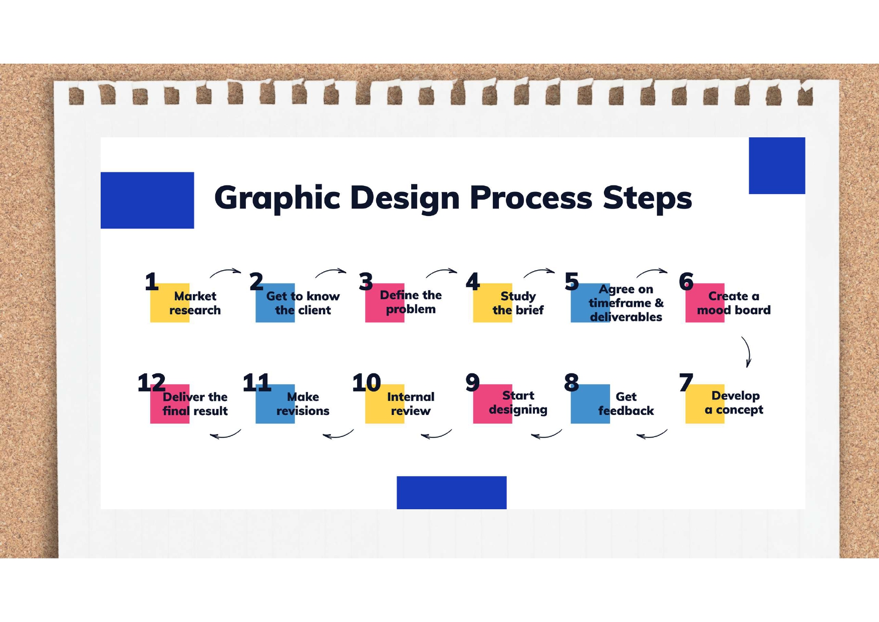
Behind the final output, there’s a structured process. From research and mood boards to revisions and final delivery, each step aims to solve problems with empathy and precision—not just create something that looks good.
Google: A Masterclass in Minimal Visual Identity
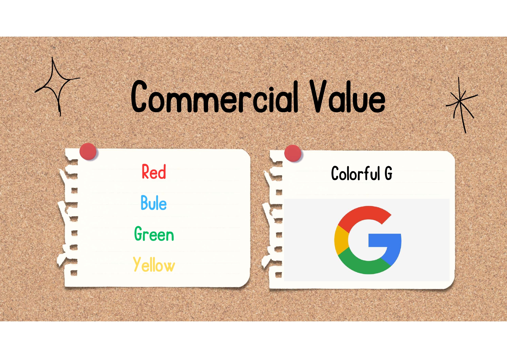
One of the most interesting modern examples of graphic design’s power is the Google logo. At first glance, it’s simple—just six letters in playful colors. But this design carries immense weight. It communicates reliability, neutrality, and a global identity.
Each letter, colored in red, blue, yellow, or green, contributes to a balanced palette that conveys both seriousness and approachability. The consistent use of these colors also shows up in other icons like the Chrome browser.
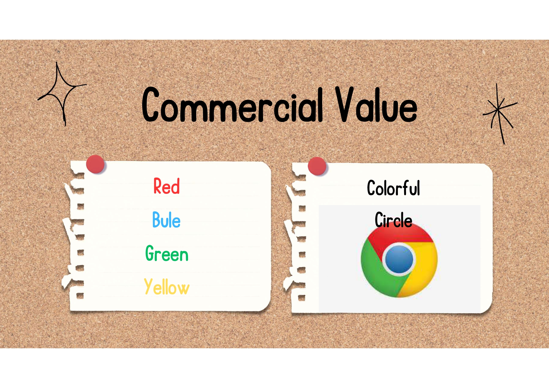
But it’s not just the logo. Think of Google’s evolving icon: the capital G, the four-color circle, or the interactive Doodles.
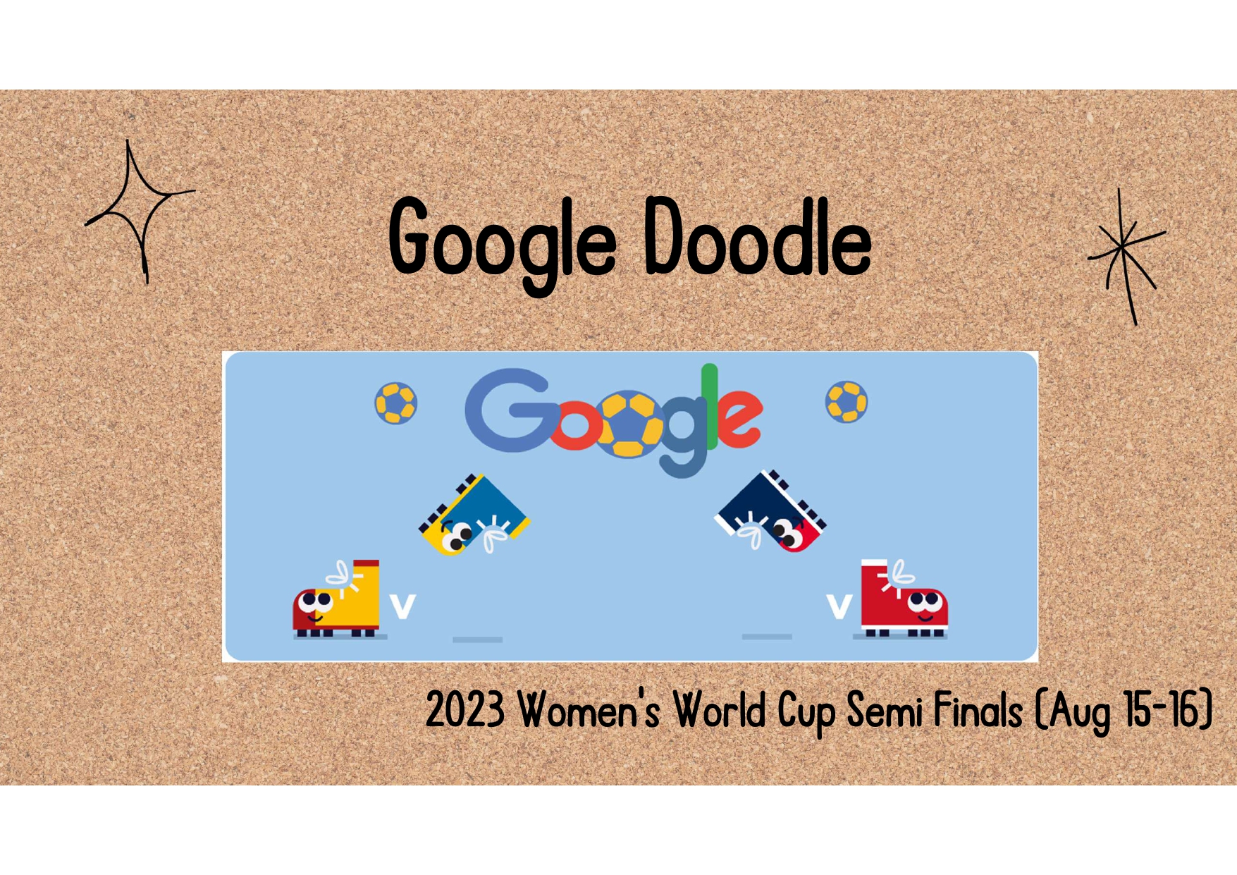
Google Doodles are especially fascinating to me. They’re not about commercial branding—they’re cultural signposts. By honoring events like the Lunar New Year, Labor Day, or the Women’s World Cup, they show how design can reflect shared values and respond in real time to collective moments.
This adaptability turns Google’s visual identity into more than a logo—it becomes a dialogue. The ability to remain recognizable while shifting its shape is a powerful reminder that graphic design doesn’t always need to be fixed. It can be dynamic, expressive, and responsive.
Rethinking the Map: The NYC Subway Redesign
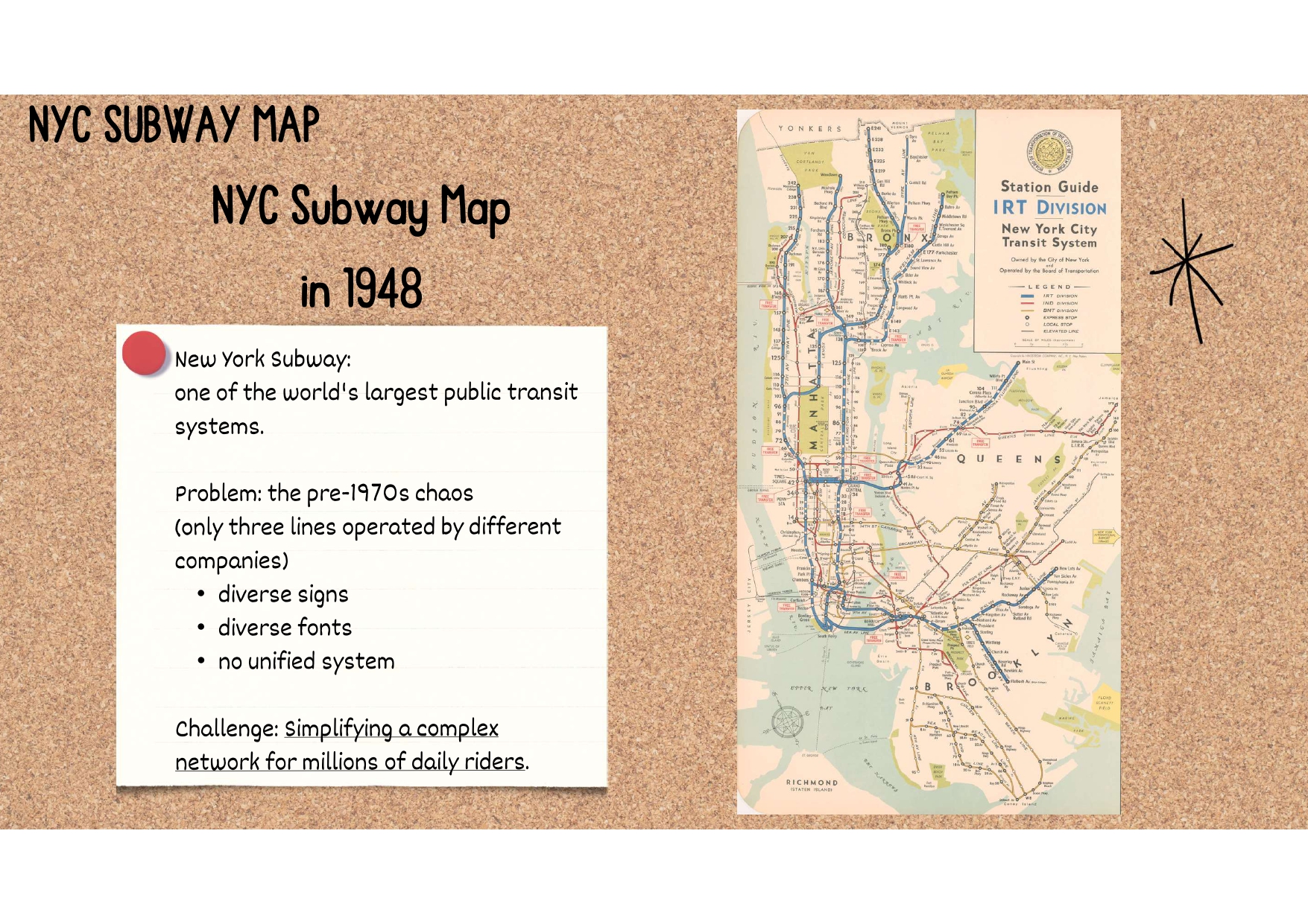
On the other end of the spectrum is the redesign of the New York City subway map in the 1970s. Massimo Vignelli and Bob Noorda’s task wasn’t about branding—it was about order. At that time, the subway system was a chaotic mix of mismatched signs, styles, and logic.
Their solution was radical: discard geographic realism in favor of a clear, abstract visual logic. The map they created wasn’t meant to replicate the city’s layout but to help commuters make sense of their route. It prioritized what mattered to riders: starting point, destination, and key transfers.
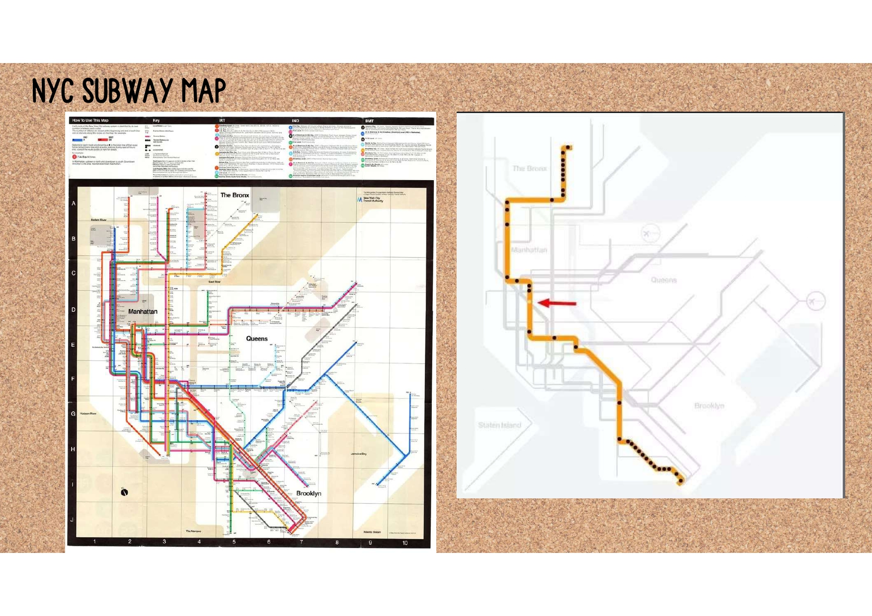
The map used straight lines, color-coded routes, evenly spaced stations, and a clean typeface to guide users through a dense, layered network. It reflected not just design principles, but cognitive science—recognizing the limitations of human memory and attention.
Some criticized the map’s detachment from geographic truth, but its impact was undeniable. It offered clarity in complexity, structure in chaos. Even today, while new iterations have reintroduced geographic accuracy, the core of Vignelli and Noorda’s system—consistency, simplicity, and function—remains.
What These Cases Taught Me
Google’s evolving iconography and the NYC subway’s rationalized map sit at opposite ends of the design spectrum—one fluid and expressive, the other rigid and systematic. But both demonstrate that great design meets people where they are.
It adapts to context, culture, and cognition. It asks: What does this person need to know? How can I show them, not tell them? Whether it’s a child recognizing a doodle on the homepage or a commuter trying not to miss their transfer, design is there—quietly guiding.
More than ever, I see graphic design as a language. One we all read, even if we don’t realize it. And in a world overloaded with information, the clarity and intentionality it offers feels not just useful, but essential.